


Ticino Web Sites
- 30/06/2014
- SEO Posts
2014 Ticino Web sites with SeoWebMaster
When keeping up to date with the latest trends in web design it definitely helps to have a website which is always fresh and modern, even in our area (Ticino Web sites); it must be said, however, that these techniques should be used in the correct manner, with the aim of enhancing the user experience and to help the growth of your online business.
Some of the most popular trends can cause more harm than good if not used wisely. We frequently encounter websites with motion graphics, infinite scrolling and unorthodox layout that end up making the whole experience cumbersome and chaotic. Before you start overdoing it with new stuff it is good to take a step back and evaluate what is appropriate to our business and to our customers.
Flat Design

The world of the web designers was greatly influenced by the latest interfaces, Windows, Android and iOS, which all utilize an aesthetic ‘flat’. The Flat design does without things like drop shadows and gradients, and offers a minimalist approach to fonts, icons and other graphic elements.
The greatest challenge of the flat design is that minimalism is hard to do well. For example, bold font and simple icons on white background require the choice of font styles particular, a strong visual hierarchy and a perfect spacing between the elements. When it is not done properly, a flat design can result in a poor experience for the user.
Responsive website design
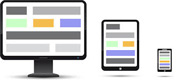
Responsive design is a rather new trend and somewhat steep learning curve for designers and developers. Since responsive websites are “all in one” solutions created to ensure a good quality of navigation on all kinds of devices, elements such as content, navigation and usability should be treated with special care…
Content
When planning a responsive site, it is essential to define beforehand the appropriate content for each screen size, starting with mobile phones, followed by tablets and desktops. For smaller types of devices, the hierarchy of the content must be smart, because you will have less space for site messages, calls to action and the content you wish to display to the user.
Navigation
The navigation menu of typical desktop sites does not work with mobile devices. Therefore, a mobile-friendly navigation menu should be designed to be viewed on small screens. The more categories and pages your site has the more robust your menu should be.
Usability

Only in recent years the digital professionals have started to analyze the behaviour of users on mobile devices. With the increasing use of the mobile web, designers and UX experts continue to look for new ways to present compelling content.
Before embarking on a responsive design project, it is important to consider what you want to accomplish with the mobile versions of the site. For example, tablets are often used for shopping on-line and sites rich in navigation content. Mobile phones on the other hand are ideal for displaying visual content such as photos and videos, but not for tedious tasks, such as filling out forms or completing multi-step procedures. You need to provide content that satisfies both the user’s intentions that the capabilities of each device.
Deep scrolling
A site in deep scrolling makes the old rule of “above the fold” obsolete, and presents its content via vertical scrolling. The trend has developed in response to the popularity of scrolling actions performed on mobile phones and tablets, much appreciated by users.
Two of the biggest mistakes you can make on a site deep in the scrolling are providing too much content and not creating a “history”, a series of hooks to guide people to the bottom of the page. While you are trying to design a page that runs for 10 minutes (just because you can), you run the risk of creating such havoc and disorder that the usability is compromised.
The most effective way to design a page in deep scrolling is to create a series of sections that work together to create a narrative about your products or services. The page as a whole must be regarded as a brochure for your business, starting from an introduction and ending with a conclusion or a call to action. For simple brochure websites, the entire site may be constituted by a single page. For more robust sites, the home page can be in deep scrolling while the inside pages can be the standard model.
Parallax
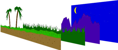 Parallax is the phenomenon in which an object appears to move relative to the background if you change the point of observation (Wikipedia).
The parallax effect is one of the most popular trends, but also one of the most abused. Parallax is the superimposition of images and texts that move on top of each other when the user scrolls through the page, creating the illusion of movement (as shown in the image).
The parallax scrolling effect presents numerous challenges. Firstly, the images should be optimized for the web, or they can cause problems with the page loading. Secondly, the design of the elements to be overlaid must be executed with precision, or the end result can be visually unappealing. The speed with which the elements move, referred to as the coefficient of parallax, must be adjusted to provide a fluid movement that does not tire the eyes and allow any text included to be easily readable.
Motion graphics
Motion graphics are effective when used appropriately; However, too many designers are going overboard with effects that often create confusion and undermine the usability. We’ve all seen over the top motion graphics to the point of causing seizures which have no tangible value for users. Each element of a website should bring the user closer to conversion and unnecessary design should be avoided.
Current trends are moving towards simplicity and optimization for mobile devices, putting user experience as the central objective. Use visual effects sparingly and always keep the idea that they should play an important role in improving the user experience and bringing in new conversions.
All of these technologies, and much more are also available in the Ticino Canton with SeoWebMaster.
SeoWebMaster propone periodicamente articoli d'attualità nel mondo di SEO, siti web e, più generalmente, di tecnologia. SeoWebMaster periodically offers current posts in the world of SEO, websites and, more generally, of technology. SeoWebmaster bietet regelmäßig aktuelle Beiträge in der Welt der SEO, Websites und, ganz allgemein, der Technologie.
SeoWebMaster and blog
The agency offers a complete service in web area, by updating you also about the most recent technologies through this blog. We provide our experience in each phase of development process in order to reach optimal results in different areas
Request a quote
We offer professional SEO services which will help your website increment the organic search traffic and compete for the 1st page with the most strategic keywords.
Recent posts
See all posts


